Can your brand colours work on a readable Arabic and English website?

Keep your identity recognisable while choosing tested colour pairs for text, buttons and states. A practical role table is more useful than approving a palette without seeing how customers use it.
In this guide
Keep the identity, but give each colour a defined job
Your brand colours can often work on an Arabic and English website by assigning them different roles. A pale accent may suit a decorative panel while a darker companion handles prices and instructions. Approve specific foreground-and-background pairs, rather than judging a swatch by itself.
Start with approved colour values and the screens customers actually use. List body copy, headings, buttons, links, input borders, errors and keyboard focus. Discuss role changes with the brand owner before individual developer adjustments gradually produce an inconsistent site.
Use the correct threshold for the element being tested
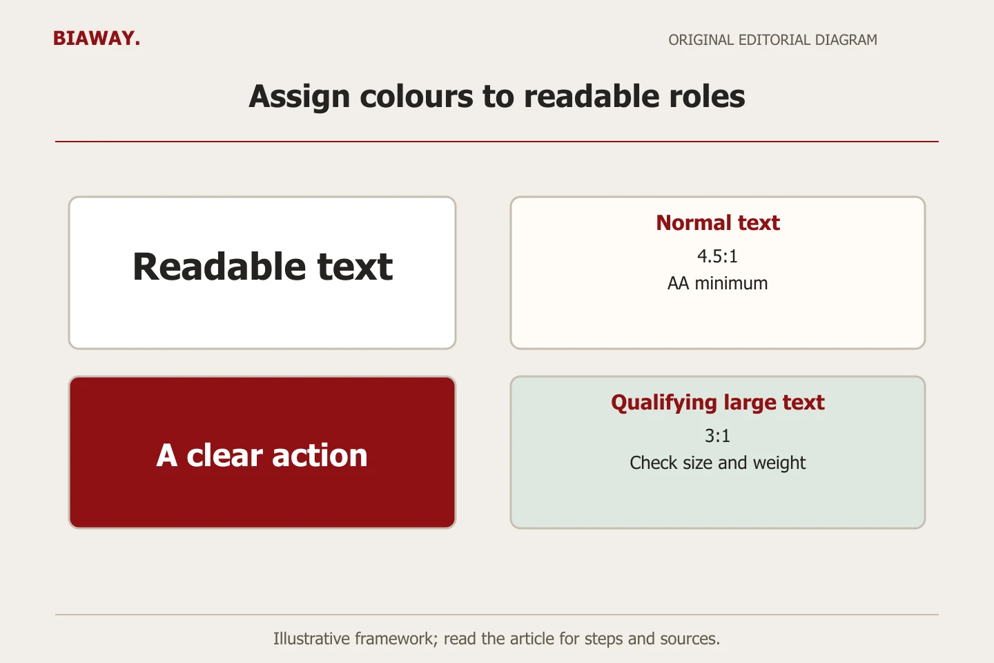
WCAG 2.2’s minimum text-contrast criterion generally requires 4.5:1 for ordinary text and 3:1 for qualifying large text. Large text is generally at least 18pt, or 14pt bold, with an equivalent size for other scripts. Logotype text is exempt from this criterion; ordinary branded headings and button labels are not. A value below a threshold cannot pass by rounding it up.
The non-text criterion generally requires 3:1 against adjacent colours for visual information needed to identify controls and states, subject to its exceptions. A text label and a control’s necessary visual cues therefore need separate consideration. Meeting these contrast checks does not establish full WCAG conformity.
References: W3C WCAG 2.2: understanding contrast minimum · W3C WCAG 2.2: understanding non-text contrast
Test an original palette by role, rather than by taste
Illustrative example only: a fictional Saudi interiors business has cream #FFF8EE, charcoal #272727, bronze #A57B4F and burgundy #5B2534 in its palette. The table below uses calculated sRGB relative-luminance contrast for solid, fully opaque colours. Values are displayed to two decimal places for readability; decisions use the underlying values. These colours are an example, not a proposed change to Biaway’s identity.
The bronze accent is still useful, but it should not become small body copy on cream. The team can keep bronze for decorative detailing and choose charcoal for the explanatory paragraph. This resolves a specific usage problem without replacing the entire palette or pretending that a new logo is required.
Scroll the table sideways to read every column.
| Proposed role | Foreground / background | Ratio and decision |
|---|---|---|
| Body copy | Charcoal #272727 / cream #FFF8EE | 14.17:1 — suitable text pairing in this solid-colour example |
| Small secondary text | Bronze #A57B4F / cream #FFF8EE | 3.59:1 — reject for ordinary small text |
| Qualifying large heading | Bronze #A57B4F / cream #FFF8EE | 3.59:1 — possible only when the large-text definition is met |
| Primary button label | White #FFFFFF / burgundy #5B2534 | 11.94:1 — usable label pairing; test other states separately |
| Outside focus indicator | Burgundy #5B2534 / cream #FFF8EE | 11.32:1 — test its actual placement, visibility and shape |
Measure the actual component, including its states
Create one sample of each important component using the implemented font, size and colour values. Inspect the button before interaction, on hover, with keyboard focus and after it has been selected where applicable. A strong default state does not prove that a pale hover treatment remains readable. Record the actual foreground and background at each state instead of approving a screenshot of the palette alone.
Photographs, gradients, translucency and video backgrounds need additional inspection. Place essential text on a predictable solid surface, or test the complete overlay against its actual background. A nominal brand hex value ignores opacity and other effects that change the rendered result.
For an error state, review the words as well as the colour. An explicit message beside the affected field gives the user a useful next step. Keep this contrast review connected to a broader form review covering labels, keyboard operation and recovery, rather than marking an entire form accessible because its red is dark enough.
Approve Arabic and English examples at real sizes
Build two short sample pages with the actual Arabic and English typefaces. Include a long service name, a price, a short button, a multi-line error and a mixed Arabic/Latin reference. Keep the business meaning equivalent, but let each language wrap naturally. A decorative Arabic heading should not force important instructions into an unusually light or tiny style just to match the English composition.
Review a phone-sized layout and a desktop layout, then check zoom and the available text space. Ask a reviewer to find the price, identify the active option and recover from an error without being coached. Record the element that caused hesitation. This produces a more useful revision request than “make everything darker”, which can remove hierarchy while leaving the actual problem unidentified.
Give the developer a colour-role acceptance sheet
Use this original checklist to move from a subjective palette discussion to a repeatable component decision. The sheet should travel with the design handover so later campaign pages do not accidentally reintroduce a rejected pairing. Keep the test result separate from the owner’s visual approval: both are needed, and they answer different questions.
- Inventory the roles: name each text, action, border, focus and status use instead of approving colours in isolation.
- Record the real pair: supply foreground, background, opacity and the intended font treatment for each component state.
- Calculate and inspect: compare against the applicable criterion, retain the unrounded result and review the rendered component.
- Approve both languages: check Arabic and English examples, mixed text, small screens and a longer message.
- Handover with limits: list approved and rejected uses, remaining accessibility checks and who reviews future changes.
Use the same readable system across your real Saudi coverage
Imagine an online service enquiry form used by customers across Saudi Arabia. People choosing Hofuf or Mubarraz within Al Ahsa must be able to read the location options and their confirmation state just as clearly as someone choosing Dammam or Khobar. Test those actual labels in the Arabic form; shorter placeholder text does not reveal how the finished choices wrap.
For Riyadh and Jeddah, check the longer service or delivery notes your business genuinely needs, without introducing special city colours that carry meaning only to the designer. A consistent readable component system can handle different customer contexts. Biaway can review branding and website components remotely for these areas; the example makes no claim of local branches, project clients or guaranteed improvement in enquiries.
Scope a contrast review without promising a complete audit
Ask the provider which templates, components, states and languages are included. A short brand-to-website review might produce a role table, revised component samples and implementation notes. A wider accessibility assessment involves other criteria and different testing tasks. State the boundary in the proposal so a palette improvement is not mistakenly sold as a complete accessibility certification.
Recheck the live pages and retain the approved role sheet. Review later photographs, overlays and button changes against it. Tested combinations clarify responsibility for exceptions; contrast alone cannot guarantee comfortable reading for everyone, legal compliance, higher search rankings or more sales.
How this guide was prepared
Prepared with AI assistance, with platform and accessibility claims checked against the primary sources below at publication. The planning frameworks are Biaway’s editorial recommendations. Examples labelled illustrative are not client stories or measured results. Platform features and requirements can change.
Your questions.
01Must I change my logo if its colours have low contrast?
First separate the logo from ordinary text and controls. Review their actual roles with the brand owner before assuming that the project needs a logo redesign.
02Can a light brand colour stay in the design?
Often yes. Reserve it for an appropriate decorative role or pair it with a suitable background, while keeping essential information readable. Document the specific approved use rather than declaring the colour universally safe.
03Does the Arabic website need different brand colours?
Not automatically. Test the real Arabic typography and component sizes alongside English, then approve combinations that work in their actual contexts. Language layout and type treatment still need review.
04Does a passing contrast report mean the whole website is accessible?
No. A contrast review has a defined scope. Keyboard interaction, meaningful structure, labels, media alternatives and other accessibility concerns require their own appropriate checks.