How to communicate your website vision to a designer without vague feedback
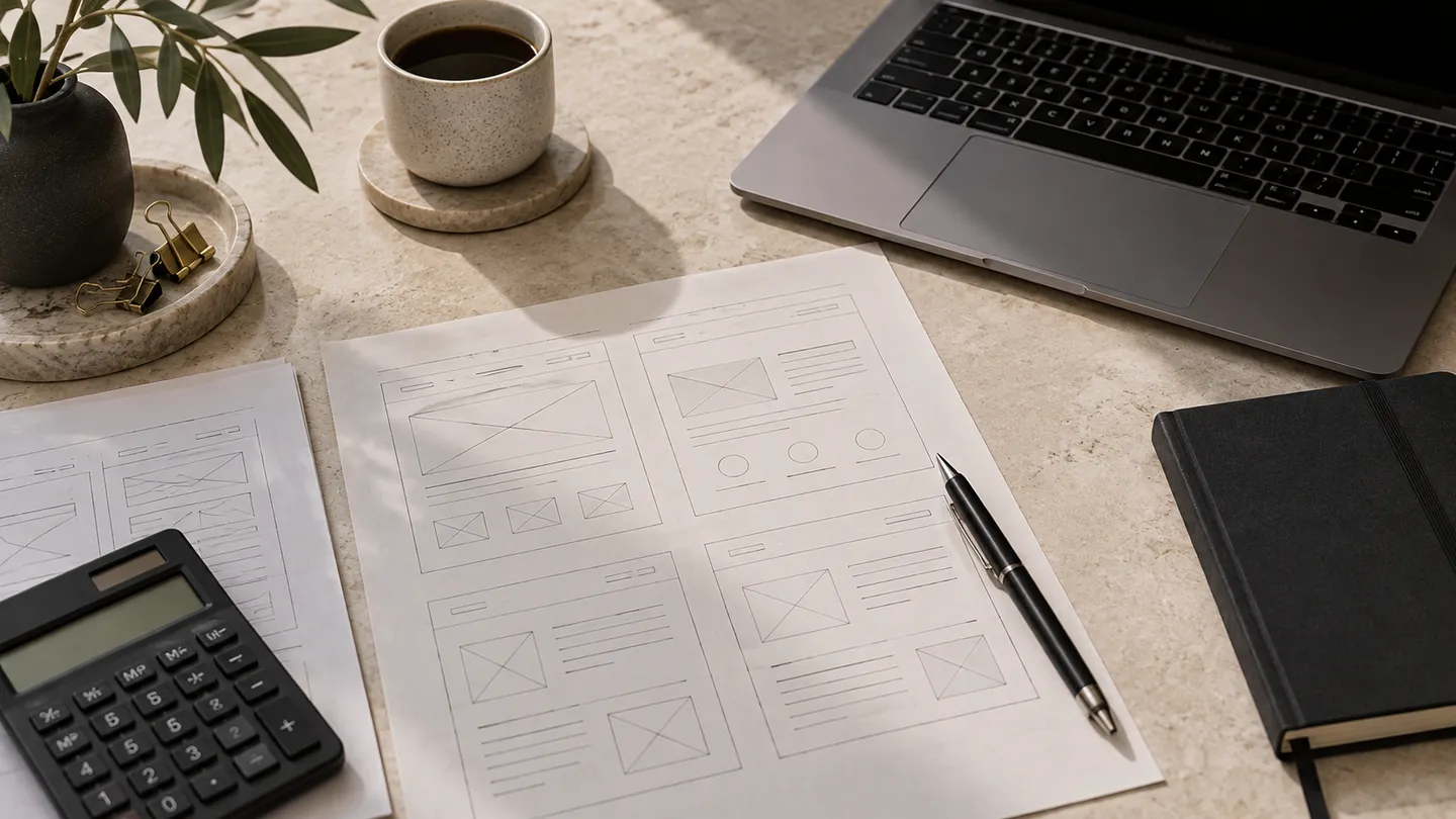
Explain the impression and customer task you want, then support it with examples and constraints. Words such as modern, premium or clean can mean different things to different people. A useful conversation translates those preferences into decisions about content, hierarchy, imagery and interaction.
In this guide
Describe the customer experience
Write what a visitor should understand in the first section and what they should do next. For example: 'A procurement buyer should identify our product categories and know what to send for a quotation.' This gives the designer a purpose beyond visual taste.
Describe the tone with contrasts that have practical meaning: concise rather than heavily promotional, calm rather than animation-led, or detailed specifications rather than large lifestyle imagery. Explain why the choice fits the service.
References: W3C WAI: planning accessibility · W3C WAI: page structure
Use references with annotations
Choose a few public examples and identify specific features you find useful, such as readable typography, clear service cards or a simple mobile menu. Also state what you do not want to copy. References should communicate preferences, not authorize copying another business's content or identity.
Separate admiration for a photograph from admiration for the layout. A design may look impressive because of expensive original imagery that your project does not have. Discuss the actual available assets.
Give feedback tied to a problem
Instead of 'make it pop', say which information is hard to notice and why it matters. Instead of 'the Arabic feels wrong', identify a phrase, direction issue or reading difficulty. Use screenshots or marked comments with the page and section named.
Consolidate feedback through one approver. Resolve internal disagreements before sending contradictory instructions. Keep a record of approved decisions so the team does not reopen the same issue without a reason.
Ground the vision in Saudi operations
If the site serves Hofuf and Mubarraz in Al Ahsa, show the real customer task and service arrangement. For Dammam and Khobar, explain relevant delivery or quotation needs. For Riyadh and Jeddah, clarify remote or shipping work. Saudi Arabia identity should come from truthful content and appropriate language, not decorative landmarks that imply nonexistent offices.
Review a representative page before the whole site
Approve the content hierarchy and visual direction using realistic Arabic and English material. Test it on mobile and desktop. If the direction does not fit, explain the mismatch before the team repeats it across every page.
Distinguish a correction to agreed requirements from a new preference or feature. A clear feedback process protects the budget and gives the designer room to solve the problem rather than guessing what an abstract adjective means.
References: W3C WAI: planning accessibility · W3C WAI: page structure
How this guide was prepared
Prepared with AI assistance, with platform and accessibility claims checked against the primary sources below at publication. The planning frameworks are Biaway’s editorial recommendations. Examples labelled illustrative are not client stories or measured results. Platform features and requirements can change.
Your questions.
01Should I design every screen myself?
Not unless that is your role. Explain goals, constraints and preferences, then let the designer propose a coherent solution.
02Can I change my mind after approval?
You can discuss changes, but they may affect scope, timing and cost. Use the agreed change process.